 It has been a couple of weeks since I last wrote about Information Architecture, be it IA and user testing or designing for the mobile web in mind, and I want to talk about a topic today which relates somewhat to a somewhat new-ish step in Information Architecture, namely the integration of user retention and user interaction.
It is not news to anyone that I – like so many – enjoy video games, come on, it is a multi-million pounds industry. Game publishers have sought to expand their marketing influence in a number of new ways, some of them have started using social networking sites such as Facebook, MySpace, Digg, etc to promote their games either via their own channels, or via publicity stunts (Wii Fit girl anyone?). The message is clear – generate interest, generate sales. Since the company I work for has just signed a deal with a UK-based games publisher with Japanese roots and a European charm I have been looking more into the information architecture of this (still rapidly growing) market, which in turn has opened another door or two for additional potential clients.
As with pretty much every website, your website needs to captivate, generate interest, expect interaction from its visitors, and provide enough information for a visitor to make an informed decision and commit to buy (‘buy’ = a call to action to purchase or make an enquiry). You now need to ask yourself:
What are the important browsing routes for a game publisher’s website? Where does a visitor need to go? Who are the visitors? What do the visitors hope to achieve on this site? How do you sell a product? How do you show the publisher in the best way possible – to then show the published products in the best way possible?
For this purpose, let us look at the main focus points of the site we are specifying, looking both at the benefits and considerations.
Please note: while this article is focused on a games publisher’s website, most (if not all!) of the points mentioned here will be valid for pretty much any site.
.
A visitor’s first visit – What am I doing here? What do I want?
Let’s first think about an average user’s visit to a website. I – the user – am coming to the game publisher’s website to find out more about a game, maybe see if the game is suitable for me, if the graphics are nice, what the requirements are and if there are any comments, problems and solutions for the game….and if I want to ask questions about it or if I want to go and buy it.
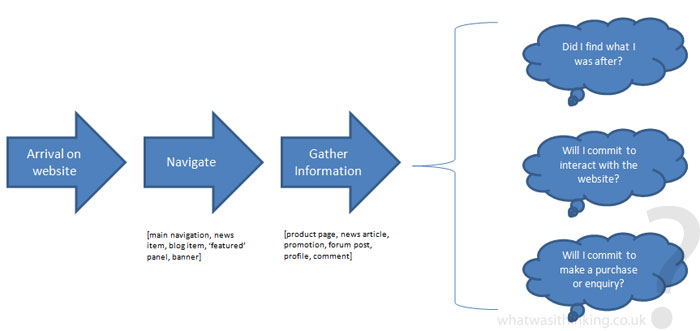
As with every site, the visitor’s flow is usually the same:

The information architect’s role is – put bluntly – to facilitate the user’s navigation from the start of the journey (the home page) through the site in the best possible way, having provided the most amount of information for the user to make an informed decision to commit to use the final call to action (the product purchase or the enquiry page).
As I said before, this pretty much applies to every site you will be working on, in this example our user base or target market is the average gamer interested in a game, or the concerned parent to see if the game is suitable for their children.
.
Informing the user – I am here for a reason, inform me

Right from the start an information architect needs to think about what the product or the information is, how the user will make use of it, how the user can find it, how it relates to other products / information on the site, and how to convert the visitor to a customer or (in the sense of user-generated content) a participant.
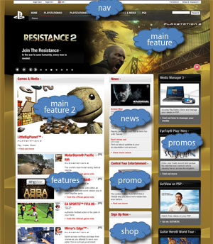
For the homepage, your main focus point is to show the most important browsing routes, namely:
- Main navigation
- Main featured item (game)
- Featured items (games)
- News
- Blog (if applicable)
- Shop (if applicable)
- Promotional slots (includes banners)
- Ancillary navigation (about us, site terms, etc.) – anything that is not necessarily required to convert a visitor to a customer
This already gives you quite a bit to play with, how much focus you are putting on what item is then considered depending on the actual product the website is selling (in this case games).

As a rule of thumb, your main browsing route to the product should pretty much cover 50% or more of any content above the fold. The ‘fold’ is still considered to be about 750px from the top of your screen (looking at the UK Playstation screenshot [or the live site here] the fold is going through the Little Big Planet image and just under the first news story), and is what should appear on the screen of a 1024×768 browser window without you having to scroll.
This is your main selling space, anything on this area will be seen – and will already influence your visitor in his / her 3 main reasons for being on the site. If the content is designed well, is accessible, usable and in a language the visitor understands then you are on the best way of converting your visitor to a customer.
Remember, only about 5% of all visitors will read the home page in full, so good imagery, striking headlines and easy to spot call to actions and links are key!
.
Coming up in part 2…
In part 2 of 4 I will talk about displaying information for both the existing and prospective consumers or customers and what considerations need to be made to “inform to commit to buy or enquire”. Stay tuned! 😉
Jonathan
December 3, 2008As usual, another great article that provokes more thought on the oft-neglected area of IA… I wonder how many games/software developers give thought to IA when designing interfaces for games/software?
Vivian
December 3, 2008Thank you very much for the article (and your other ones about IA and usability testing) 🙂
Sarah
December 11, 2008Some great ideas there 😀