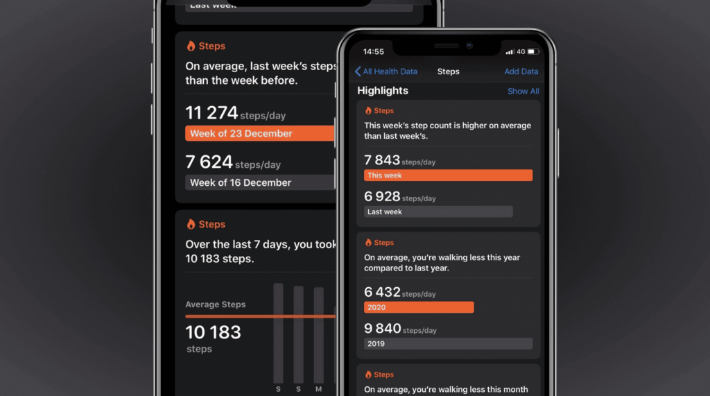
Accessibility should be at the heart of every product, and it’s not any different for data visualizations. By making your graphs accessible, you not only ensure that everyone can use them but also that they are easier to understand.
Sarah L. Fossheim develops and designs software for the education sector and previously worked in cancer research. In medical software, for example, an inaccessible or confusing graph could lead to critical mistakes, such as giving the wrong medication to a patient.
To help everyone build better and accessible data visualizations that prevent confusion and misunderstandings, Sarah summarized ten dos and don’ts to keep in mind whenever you’re designing a chart or a graph.
https://fossheim.io/writing/posts/accessible-dataviz-design/

 I bumped into a former student of mine this evening – pleasant surprise. We had a quick chat about work and life, and he asked me if there was a quick way to explain the Usability Heuristics to someone in his company that would not involve a lot of reference material.
 I was just talking to an acquaintance of mine (a php developer) about website design when we started discussing accessibility and usability. His response was:
  Those of you following me on twitter know I tend to spend a bit of time every couple of days in finding new extensions for FireFox (and sometimes Thunderbird) which are making my life as an Information Architect, Web Designer or Project Development Manager easier. These extensions may be some all of us have been using for ages but never really realised we had them installed, or some we really wanted to see or use for some time, but never really spent the time researching whether these extensions are actually available. This is the list of February…
 Today I closed my 11th SEO proposal. This may not sound very impressive (and it isn’t a high profile client either), but it does to me, not only because it adds a few more numbers for the account handlers, but because it means that my sales strategy works (11 out of 11 closed) and that the data I am showing and preparing is useful.
 My day to day work consists of a lot of time spending on the internet, looking at web presences of current clients, prospective clients and their (and our) competition. My tool of the trade being FireFox 3 (especially considering that
  Google just launched its beta of