Browse Tag

best-practice

UI Components Handbook

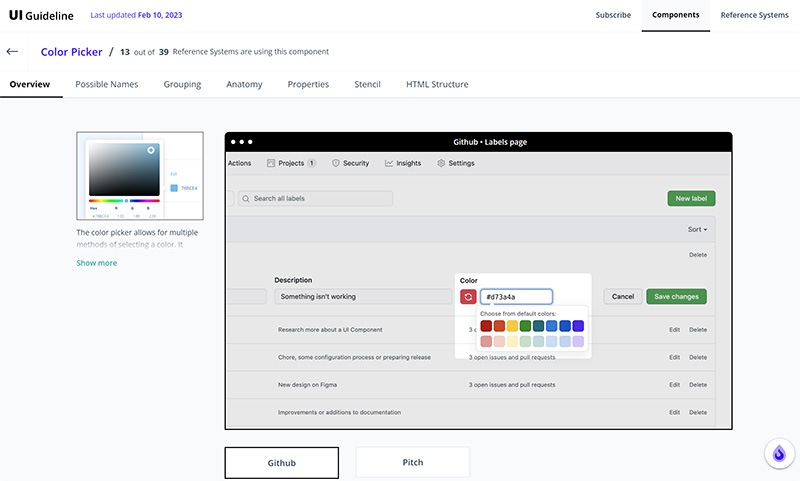
No matter what kind of UI component you’re working on, there’s no need to reinvent the wheel. To make your work easier and shorten research time, the folks at UI Guideline analyzed some of the most popular design systems and UI libraries to standardize the design and code of more than 40 UI components. The result is the UI Components Handbook.

For each component, the handbook gives you an overview of real-world examples, anatomy, grouping, and properties of the component. The cherry on top is a ready-to-use Figma component that includes all the best practices and the ready-to-use HTML code that you can use as a starting point to code and style your own component.

https://www.uiguideline.com/components

Better Authentication UX

Authentication is a tricky subject; if done wrong, it can break a user experience. There are password rules that make it hard to remember the password we chose and well-meant security questions that might even lock us out of our accounts instead of providing an extra layer of security. And nobody likes to identify crosswalks and fire hydrants either. So how can we fix the authentication UX for good?

That’s exactly the question that Jared Spool explores in his presentation “Fixing The Failures of the Authentication UX.” He explains how to make authentication design a priority in your experience architecture and where the real risks are so that you can best protect your users — without frustrating them.

Fighting Deceptive Patterns

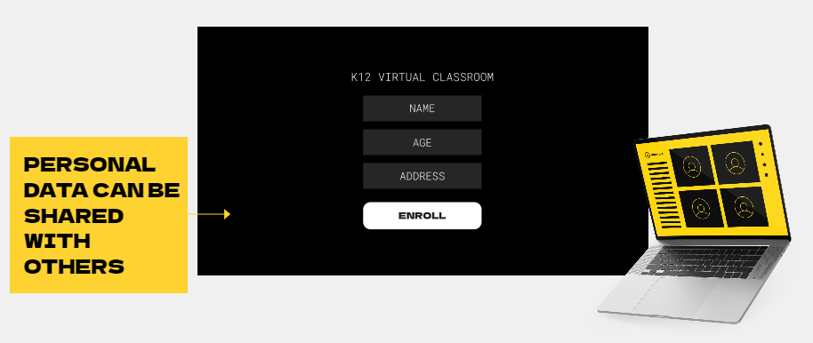
Deceptive patterns can be hard to spot, but they are all around us: Social media apps forcing us to connect our phone numbers, “free trials” that automatically turn into paid services without a reminder, or prompts where the “no” option is well-hidden. The list could go on. Luckily, there are some great initiatives out there that take a stand against Deceptive patterns.

One of them is the Dark Patterns Tip Line. To raise awareness of the harm that manipulative design can cause, it crowdsources stories of digital manipulation. The goal is to help policymakers and enforcers hold companies accountable for their practices. So whenever you come across a dark pattern, don’t hesitate to report it to the tip line.

The hall of shame by Deceptive Design also collects stories from users who had to deal with deceptive patterns. The same goes for the Dark Pattern Detection Project. Their goal is to develop an open-source, AI-based text analysis tool that detects deceptive patterns automatically and redesigns them in a personalized manner for the respective customers.

The Best UX Research Methods in a Pinch

Jordan Bowman wrote a great post to help you find the right UX research method for your project. In “The Best UX Research Methods in a Pinch,” he takes a closer look at six methods that don’t take much time or money but give you the insights you need, quickly and effectively.

https://uxtools.co/blog/best-ux-research-methods-in-a-pinch/

Usability Heuristics Frameworks

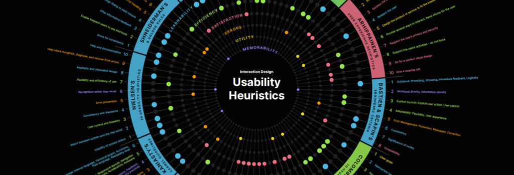
For many UX designers, Jakob Nielsen’s “10 Usability Heuristics for User Interface Design” is the go-to evaluation approach. However, sometimes you might discover discussion-worthy user experience problems that don’t fit the mold.

Michael Kritsch was in the same situation and started searching for alternative usability heuristics frameworks. This led him to the question: How to choose the appropriate method? To help you make an informed decision, Michael explored, categorized, and standardized ten heuristics. He summarized his findings in a comprehensive article.

https://uxdesign.cc/usability-heuristic-frameworks-which-one-is-right-for-you-1962387b7cc

The Design Systems Guide

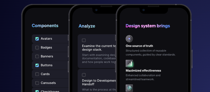
Getting a design system right is hard. There are so many different types of design systems and so many ways of setting up one and maintaining it over time. Fortunately, there is plenty of incredible resources all around design systems. But where do you even start? What would be a good process to use to make sure that your efforts don’t hit the wall of tough deadlines and final tweaks? The Design System Guide, kindly released by Romina Kavcic, has got your back. The guide is a very comprehensive interactive book on the foundations of design systems, design metrics, design tokens, checklists, and handy resources for managing design systems.

https://thedesignsystem.guide/

Good Design Principles

Establishing a set of design principles for a project or brand can help teams create more consistent user experiences. They aid decision-making and make it easier to keep the product aligned. If you plan to establish a set of design principles for your product, we came across useful resources that will help you get started.

Ben Brignell curates an open-source collection of 195 design principles and methods. It features both heuristic design principles and design principles developed by companies specifically for their products. All of them are searchable and tagged, from hardware and infrastructure to language and organizations.

https://principles.design/

Documenting Accessibility

Image of a Guide to Documenting Accessibility

Unfortunately, accessibility is still an afterthought in many projects, even though fixing it later is usually a lot more expensive than doing it right from the beginning. Documentation is an effective means to help teams keep an eye on accessibility in every step of the process. But what do you need to consider?

Stéphanie Walter summarized how designers can document different aspects of accessibility and user interaction requirements. If you don’t have the time to document everything in your design mockups, Stéphanie suggests to focus on the things where there might be the biggest issues and misunderstandings.

Link: https://stephaniewalter.design/blog/a-designers-guide-to-documenting-accessibility-user-interactions/