Browse Tag

Information Architecture

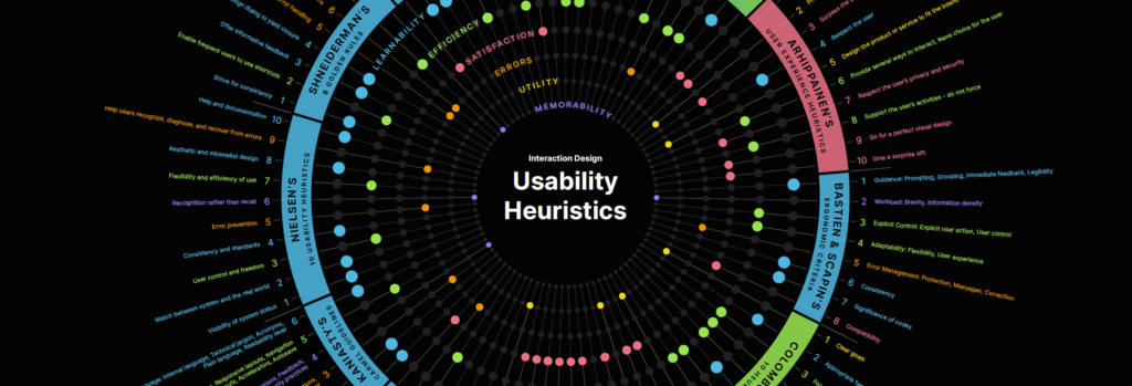
Usability Heuristics Frameworks

For many UX designers, Jakob Nielsen’s “10 Usability Heuristics for User Interface Design” is the go-to evaluation approach. However, sometimes you might discover discussion-worthy user experience problems that don’t fit the mold.

Michael Kritsch was in the same situation and started searching for alternative usability heuristics frameworks. This led him to the question: How to choose the appropriate method? To help you make an informed decision, Michael explored, categorized, and standardized ten heuristics. He summarized his findings in a comprehensive article.

https://uxdesign.cc/usability-heuristic-frameworks-which-one-is-right-for-you-1962387b7cc

Axure RP 6 released!

The popular wireframing tool has just been updated to v6!

Aside from a number of fixes, the most notable features of this version are:

  • Sketch Effects – Sketch Effects enable you to give your wireframes a more sketchy, grayscale look and feel to allow the audience to focus on the information architecture, interactions, and functions of the prototype more than the “finished” look
  • New Wireframing Tools – wireframes are now faster to build and easier to maintain by adding Global and Page Guides, a Location and Size tooltip, Format Painter, ability to Copy and Paste. Annotations, and a new Custom Style engine where custom styles can be applied to rollovers.
  • Improved Text Editing – Axure RP was upgraded to use WPF in the Microsoft .Net Framework 4.0.  The new text engine allows information architects to add text editing at zoomed levels, line spacing, and Open Type Fonts. There is also some text padding in shape widgets.
  • Page Styles – you can finally center pages, apply background colours and background images without having to do it manually!
  • Richer Prototypes – Axure RP6 now has animations for moving and fading, Math and String functions, Drag and Drop interactions, and new Dynamic Panel Events to respond to moving, changes in visibility, and changes in state.
  • More Specification Control – You are now able to organize the content, optionally include headers, filter widget tables by annotation values, generate a master usage report, generate all of the widget text, configure column widths for two column layout, and configure the screenshot size. And you can also format the page notes and annotate master instances.
  • AxShare integration – You can now manage an account of up to 10 active prototypes. It supports RP files (up to 10 MB) created in version 6 or earlier and all generated prototypes will have the version 6 skin. You now also have access to a new Discuss tab next to the sitemap in the prototype (which you can disable), as well as a page for viewing the discussion topics in your AxShare account.

Axure RP 6 is available for both PC and MAC here.

Good times! 🙂


10 ways to improve the usability of your e-commerce site

10 ways to improve the usability of your e-commerce websiteWith more and more consumers spending time on the web looking for online bargains (let’s be honest, if I see a game for £27.99 online but £34.99 in shops then I wouldn’t be thinking twice either) instead of shops, companies must ask themselves if their website is not only showing the right prices, but is also usable enough to order items from.

In 2005 there was a huge wave of online shops reworking their ordering processes to make them more usable and accessible to people, which was a sounding success for many companies. These days however more offline stores are trying to expand to the web and are asking for advice. Here are ten ways to improve the usability of your e-commerce site to maximise your conversion rate and help convert ‘browsing your wares’ into ‘placing an order’: Keep Reading

Top tips for working with developers

Strategies for working with developersWorking in a busy office is one of the best parts of being a designer or information architect – you can bounce off ideas, discuss projects with others and get their input, and you can generally have a good laugh.

That is until the time comes where a new project is being started or requirements are being updated. Usually then some sort of “rivalry” will ensue, and in 90% of the cases it will be between a designer or information architect and a developer or development coordinator. Scope was not fully explained or defined, the design is too complicated to build, or data is not coming from the sources it was meant to.

In those times frustration can quickly result in stress and lack of commitment to a project. Let’s see what we would do to remedy that…
Keep Reading

Firefox extensions for usability, accessibility and SEO experts

FireFox extensions for Usability, Accessibility and SEO expertsMy day to day work consists of a lot of time spending on the internet, looking at web presences of current clients, prospective clients and their (and our) competition. My tool of the trade being FireFox 3 (especially considering that IE seems to have a little problem). I am using a number of addons which really help my work-flow in the fields of usability, accessibility, SEO and occasionally information architecture.

I was asked by a couple of fellow twitter users to divulge my plugin list, and since I keep track of them myself at times I thought this post would come in handy for everyone.

Keep Reading

Information Architecture for Game Publisher websites (part 1)

It has been a couple of weeks since I last wrote about Information Architecture, be it IA and user testing or designing for the mobile web in mind, and I want to talk about a topic today which relates somewhat to a somewhat new-ish step in Information Architecture, namely the integration of user retention and user interaction.

It is not news to anyone that I – like so many – enjoy video games, come on, it is a multi-million pounds industry. Game publishers have sought to expand their marketing influence in a number of new ways, some of them have started using social networking sites such as Facebook, MySpace, Digg, etc to promote their games either via their own channels, or via publicity stunts (Wii Fit girl anyone?). The message is clear – generate interest, generate sales. Since the company I work for has just signed a deal with a UK-based games publisher with Japanese roots and a European charm I have been looking more into the information architecture of this (still rapidly growing) market, which in turn has opened another door or two for additional potential clients.
Keep Reading

On link usability – the art of keeping call to actions consistent

On Link usability - the art of keeping call to actions consistent Not so long ago I was asked by a client, if it was possible to change a couple of sections within their site as they just updated their product structure: the client was expanding their products to list two more categories. To make them stand out, their marketing team was thinking of using different colours throughout the main content area so that is looks much more consistent, which included changing all link colours and buttons to these new colours.

As a designer you have probably faced a similar situation before – can I or can I not change the link colours on certain pages to keep a consistent look and feel?

Yes, you can, but you shouldn’t ever. Here is why… Keep Reading

On Information Architecture and user-testing – Part 3 – Usability testing and Accessibility testing

On Information Architecture and user-testing - Part 3 - Usability testing and Accessibility testingFollowing my previous article we are now going to put our website prototype to a first test before we begin developing the website. While the functionality and navigation makes sense to us – after all, we just spent the last week(s) working on it – we need to ensure it works the same way for others as well. We understand how we get from a destination page to the product or trip we are after and finally to the enquiry page – but will anyone else do so as well?

Usability testing will reveal if the flow of the site works, and accessibility testing will ensure that our site complies to any relevant accessibility guidelines.
Keep Reading

  • 1
  • 2